We are interested in the general topic of “design.” In the desktop Reactor Lab, we started out with each new lab looking differently than the previous one. We also observed that students are interested in moving through an assignment quickly, and that this would be aided by designing a consistent layout that could be applied to most labs: input on the left, process in the center, output on the right. Once you learn how to navigate your first lab, you can use that knowledge to navigate the others.
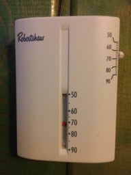
We were lucky to go skiing recently and stay in an old lodge. During the night, we got too hot. I remembered a thermostat on the wall. With the lights off and the room dark, I adjusted the slider on the side of the thermostat to a lower position in order to lower the temperature in the room. Below is a photo of the thermostat taken the next morning. What do you think happened?
We ended up cooking on top of the bed with the blankets off, even though the outside temperature was well below freezing! I had assumed that a lower temperature setting would mean sliding the control lower. Wrong! The more I tried to cool the room, the hotter it got.
What was the maker of the thermostat thinking? Maybe that Hell is down and hot, and clouds are up and cool? 😛
Design is not just nice to have. It is critical. Every time I hear about a disaster being blamed on “operator error,” I have a strong suspicion that the poor operators were trying to do their job – assuming they weren’t looking at their phones – but were more likely confused trying to operate a poorly designed system.
We recommend reading Don Norman’s recent post about the Hawaii false missile alarm, see especially the link to a photo of the operator’s software menu, and Norman’s book “The Design of Everyday Things.”
